The Environmental Research Group at Oxford University (ERGO) led by Senior Analyst William Wint and Geographical Information Manager Neil Alexander has developed state of the art geographical datasets illustrating change in human mobility during the Covid-19 pandemic.
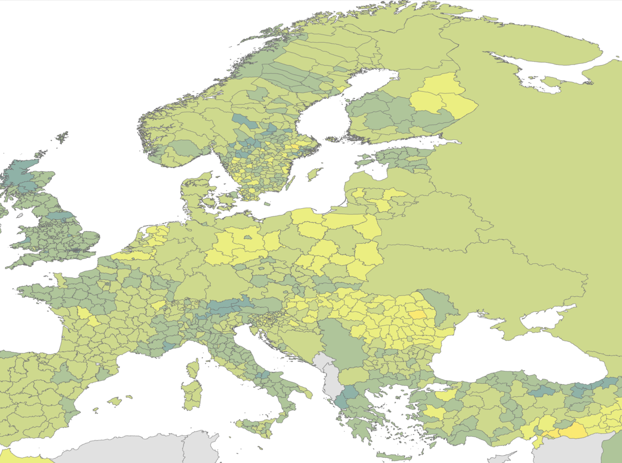
The ERGO sub-national polygon mapping files that can be used globally or within Europe which incorporates original Google datasets which help in mapping and analysis that estimates the number of people moving around daily for six different categories of places, including retail and recreation, grocery and pharmacy, parks and beaches, transit stations, workplaces and residential.

The team of data scientists and spatial analysts calculates a moving average for three days over the week of which they then produce the polygon maps. They also map the change from the beginning of January 2020 – the baseline – to that period as well as the change between that period and the week before. Essentially this yields outputs respectively mapping mobility changes over a week, from a week to the week before, and change from the year to date until the most recent week respectively.
The maps the team creates can be useful in examining changes in behavior and impact on mobility when comparing different time periods and locations. For instance, many users analyze the outputs to examine the differences between lockdown periods and how they impact daily lives in specific areas. In addition to all this, the team also provides Excel files that list all calculated mobility averages to complement the visual change calculation outputs.
According to William Wint it takes about four hours a week to keep all datasets and outputs up to date. Currently he and his team are working on maps to show how stringent the lockdown is in different places.
“I have taken the metrics for different places a week before and after lockdown… We do it for lockdown one and lockdown two and you can see the differences between countries and within countries between the different lockdowns,” explained Wint.
“The reason that we do it is that when you look at these maps, you get quite different geographical patterns. You would expect the same thing to happen everywhere but it doesn’t,” he said.
At the time of this writing, the mobility maps have been downloaded more than 18,000 times. They have circulated in the realm of the MOOD project and were sent to the European Center for Disease Control.
The information in this article was provided in conversations between William Wint, Neil Alexander, and Alexander Wowra.