A data visualization tool to uncover regional COVID-19 incidence dynamics in Germany
What do the plots show?
The COVID-19 Scatterplots application presents graphs for COVID-19 “status” in Germany. The graphs are based on the official COVID-19 statistics of the Robert Koch Institute (RKI), a German federal government agency and research institute responsible for disease control and prevention, and have been inspired by the COVID-19 monitoring page of the GIMBE Foundation, an Italian non-profit organization in the health context.
Watch the video to learn more about the background and development of the scatterplots as well as about the interpretation, challenges and outlook!
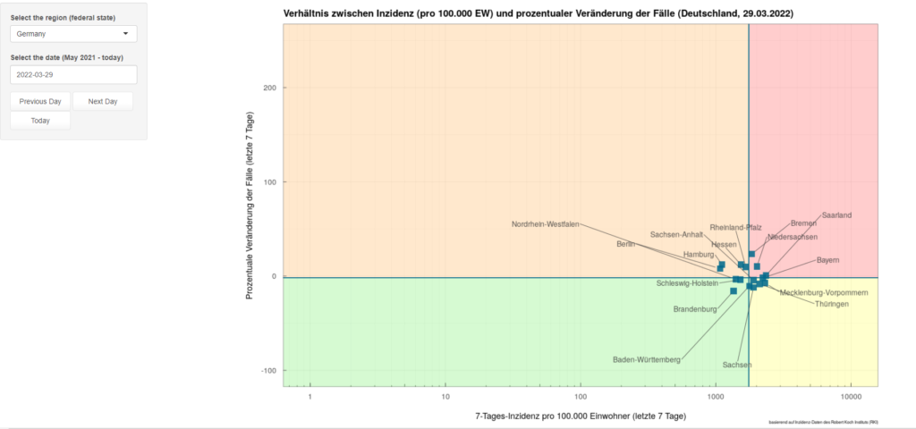
The plots use data on 7-day incidences and the change in new cases in different regions in Germany and compare them graphically. They are available for Germany and for the individual federal states of Germany with the respective counties. What can be seen is the position of the counties or federal states in relation to the statewide or national averages of the 7-day incidence and the percentage change in weekly new cases. The 7-day incidence per 100,000 inhabitants is depicted on the horizontal axis and the percentage change of weekly new cases over the last week is depicted on the vertical axis. The intersection of the quadrants shows the average values at the statewide or national level, respectively. The scatterplots are updated on a daily basis so that changes over time become visible.
Technical Features:
The scatterplots are created with R (mainly package ggplot2) and the application has been implemented with R Shiny.
Why COVID-19 Scatterplots?
The application presenting COVID-19 scatterplots for Germany was created within the MOOD H2020 project with the scope of supporting Epidemic Intelligence work in Europe. The main aims are to make grasping available information from indicator-based disease surveillance easier and to enable an easy (graphical) comparison of different geographical regions over time. The application promotes the dissemination and application of scientific information and can be viewed as an activity related to the risk assessment and communication of information regarding disease outbreaks and threatening contagious diseases at various geographical scales.
About mundialis
mundialis GmbH & Co.KGs specialized in the analysis of remote sensing data and the processing of voluminous geodata using high-performance data centers (actinia). The aim of mundialis is to enable different groups of people to access the rich remote sensing and geospatial data. Within the MOOD project mundialis usually produces maps of covariate data on a European scale. However, for the application of COVID-19 scatterplots regional statistical data is now being analysed.
Contacts


More information
Watch the full webinar and interview to Julia Haas at the MOOD science webinar (February 2022).